| Resources | Blog |
Articles |
Booking Demo |
Forum |
Help Pages |
How-To Videos |
Releases |
||||||||||||||||
| Resources: Blog |  |
|
The default settings for the Authorize.net customer payment form include several fields that are unnecessary for a typical VR business. Fortunately, Authorize.net permits you to customize this.
Sign in to your Authorize.net account. Click on the "Account" tab near the top (green circle):
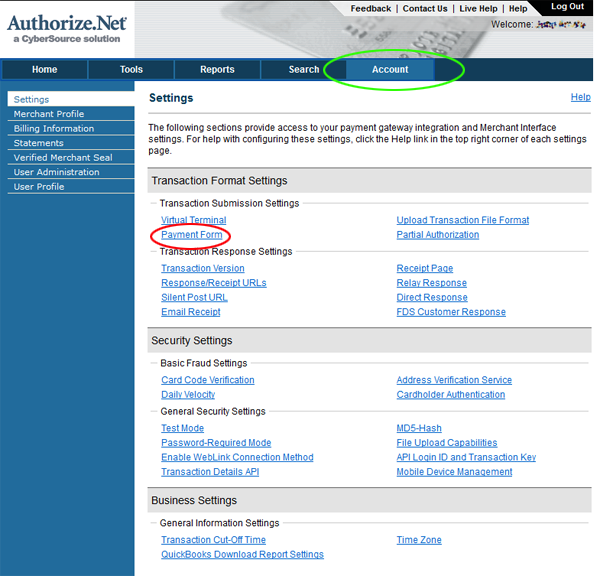
Then click the "Payment Form" link (red circle, above).
This will display a page that gives you many options for how to customize the appearance of your customer payment form:
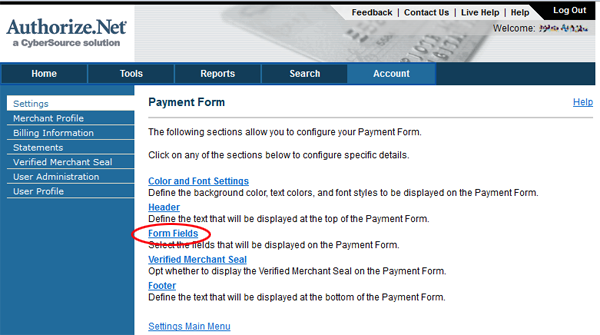
To change the required fields, click the "Form Fields" link (red circle, above). Then, simply un-check the boxes next to fields that you don't want to appear on your payment form:
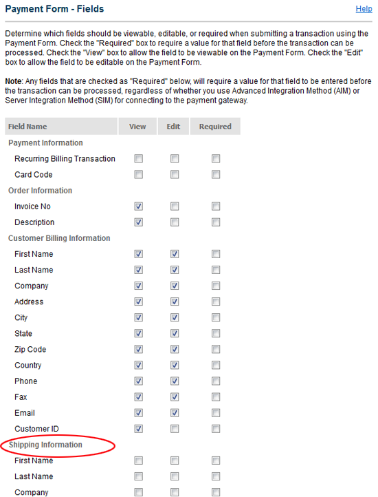
You will want to scroll down a bit to see them all, and you'll probably want to un-check all the "Shipping Information" boxes, and probably all the fields in the "Additional Information" section as this includes things like tax, freight charges and other things usually not needed for a VR business.
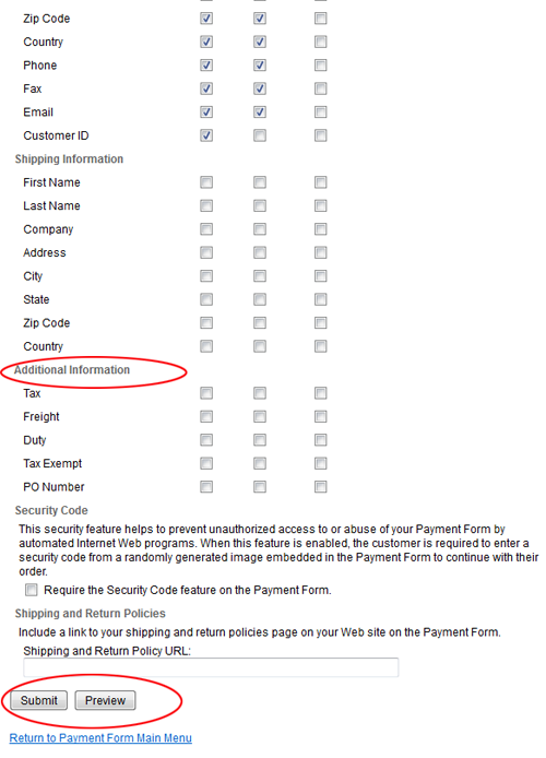
Also, don't forget to click the Submit button at the bottom to save your changes. You should Preview the payment form, always a good idea.
Authorize.net allows several other customizations to the payment form, including headers, footers, background and font colors, and more. You can even include images and some HTML content in the header and footer, but this involves emailing Authorize.net Support to send your images to them for hosting, so if you want to go that route, contact them for help.
Hope this helps!
John
Reply »
Sign in to your Authorize.net account. Click on the "Account" tab near the top (green circle):

Then click the "Payment Form" link (red circle, above).
This will display a page that gives you many options for how to customize the appearance of your customer payment form:

To change the required fields, click the "Form Fields" link (red circle, above). Then, simply un-check the boxes next to fields that you don't want to appear on your payment form:

You will want to scroll down a bit to see them all, and you'll probably want to un-check all the "Shipping Information" boxes, and probably all the fields in the "Additional Information" section as this includes things like tax, freight charges and other things usually not needed for a VR business.

Also, don't forget to click the Submit button at the bottom to save your changes. You should Preview the payment form, always a good idea.
Authorize.net allows several other customizations to the payment form, including headers, footers, background and font colors, and more. You can even include images and some HTML content in the header and footer, but this involves emailing Authorize.net Support to send your images to them for hosting, so if you want to go that route, contact them for help.
Hope this helps!
John
Reply »
Recent Posts:
Monthly Archives:
Categories:
- Minimum Days Between Bookings
- Property Deletes No Longer Permitted
- Bookerville's New Maintenance App
- Automated Refunds Are Here!
- Send Your Scheduled Emails Hourly
- "From" Address and Bookerville Email Delivery
- Automatic Emails and Listing Sites
- Vacation Rental Channel Managers
- At-A-Glance Tab Updates
- Bookerville Reads Your VRBO iCal Feed
- Guest Services Mobile App!
Monthly Archives:
- February 2021 (1)
- May 2020 (1)
- January 2020 (2)
- December 2019 (1)
- August 2019 (1)
- November 2018 (1)
- February 2017 (1)
- November 2016 (1)
- May 2016 (1)
- April 2016 (1)
- January 2016 (1)
- August 2015 (1)
Categories:


